
The weather has been rather bad. This image was really just a messing around with foreground bokeh. Why?
Pentax lenses are usually better in the foreground bokeh department than background one...

Photo Diary


Last week was marked by unsettled weather, which led me to remain at home. During this time, Joel and I exchanged messages and shared recommendations on a range of political podcasts, comparing perspectives and formats that we each found engaging.
The photograph itself may be regarded as visually distracting by conventional standards, as the foreground is dominated by out-of-focus branches rendered in pronounced bokeh. In traditional or classical photography, such foreground obstruction is often discouraged, as it can divert attention from the primary subject and disrupt compositional clarity. However, I do not find this problematic. On the contrary, the layered blur introduces a sense of depth and visual tension, challenging the expectation of a clean, unobstructed frame. I tend to lose interest in images that are overly polished or pristine, unless they deliberately embrace a minimalist aesthetic. In this context, the intrusion of foreground bokeh becomes an expressive choice rather than a flaw, resisting classical norms in favour of a more personal and interpretive visual language.
Sony A7RV
FE 70-200mm f4 G
Linking Water H2O Thursday

Another El Nina gonna hit Australia and this will be the third one in the past 10 months. This means the continuous wet weather will make my regular photo walk a bit more challenging to do so in the coming months.
When I took this shot, I kind of hope no one was going to rob me from behind...
Sony A7RIV
FE 50mm f1.2 GM

At Pearses Bay, the sunset was not captured so much as translated—softened into a haze of light and colour, deliberately unfocused, as if memory itself had taken the lens.
In the foreground, a lone rock holds its ground with quiet defiance, its edges rendered in crisp clarity against the dissolving world behind it. Beyond, the horizon melts into a wash of gold and blush, the sun breaking into circles of bokeh—glowing fragments that hover like distant thoughts, beautiful but just out of reach.
It feels almost like a dream you can’t quite return to, where only one thing remains sharp while everything else drifts into suggestion. Once, this way of seeing was everywhere—an aesthetic that traded detail for feeling, precision for atmosphere.
Here, it lingers for a moment longer: the rock anchored in certainty, the light slipping gently away into abstraction, and the evening dissolving into something softer than reality.
Sony A7RV
FE 24mm f1.4 GM
The Victorian Government appears to have pursued a policy of increasing land taxes and introducing additional levies—such as vacancy taxes, waste-related charges, business taxes, and fire service levies—with the apparent intention of placing greater financial pressure on landlords and property owners.
This approach may be interpreted by some as a strategy aimed at redistributing fiscal burden while appealing to certain voter demographics, including newer migrant and refugee communities, who are perceived as an important electoral constituency for the Labor Party.
Linking Treasure Tuesday

A stroll in the woods. Refreshing to see a mushroom. Shallow depth of field is nice too.
Sony A7RIV
FE 24mm f1.4 GM


I love shallow depth of field at one stage. It was what a lens geek would do. I have tons of shots on the shoes hung up in the laneway of Melbourne. I never quite understood why this was done first place.
My pals tell me it was a way to mark the sales point for weeds. Or it was a mysterious way to play a game.
Olympus 150mm f2
This is linking Bokeh shots

During my visit to a distinguished bird park in Japan, I found myself seated amidst a group of kindergarten children, quietly delighting in an educational lecture on the avian wonders of the world. Among the many splendid species exhibited, one particular creature drew my attention—a striking owl perched solemnly before us.
This noble bird was the Buffy Fish Owl (Ketupa ketupu), a species native to the dense riverine forests and mangroves of Southeast Asia. Recognisable by its bold yellow eyes, long lateral ear tufts, and mottled tawny plumage, the Buffy Fish Owl is uniquely adapted to its riparian habitat. Unlike many of its nocturnal kin, this owl is often crepuscular, most active at dawn and dusk, where it employs remarkable patience and keen vision to prey upon fish, crustaceans, amphibians, and small reptiles.
Unlike owls that rely solely on silent flight, the Buffy Fish Owl often perches low over water, striking swiftly when it sights movement beneath the surface. Its feather structure lacks the full silencing adaptations of other owls, a compromise in favor of resisting the moisture of its preferred environment.
As I listened to the naturalist’s words, surrounded by the innocent curiosity of children and the lush foliage of the park’s conservatory, I felt a profound appreciation for the marvels of avian biology—and for the rare opportunity to behold such a fascinating and elusive bird from distant shores.
Fujifilm XPRO2
Fujinon 16-55mm f2.8
Linking Saturday critter
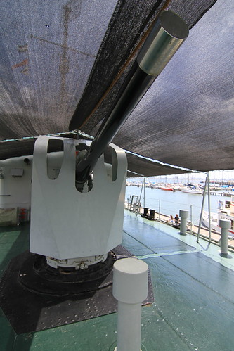
Joel preferred to leave the coast behind and venture further into an urban setting, intending to experiment with the remaining bright lenses we had acquired for bokeh photography.

I think the distracting bokeh takes away the focus of the swallow
Sony A7RV + FE 200-600mm f5.6-6.3
Linking Saturday Critter