Monday, December 13, 2010

Olympus ZD 150mm f2 gallery

This lens has been my companion for a long time. This lens has produced some pleasant images throughout my university years.

Here are the example shots taken by this lens.


Hope You enjoy browsing them.

Colour Study: Red vs Green


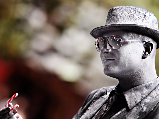
This image is taken by Pentax Fa 77mm f1.8 limited

Some friends of mine have asked me about the applications of colours. Use of colours in photography is very important. Usuaully the colour profile of an image series creates a signature style of a photographer.

Sometimes the colour choice helps to protrays a desirable context to influence a viewer's mental state.
The most interesting and utilised choice of colour combination is Red vs Green, These two colours are equally weighted towards each other in terms of impact. A visual balance of these two colours is in 1 : 1 ratio. Therefore, a variation of proportion from these two colours will help a photographer to determine where the intended focus of any image shall be. Increasing the proportion of the red colour in an image will diminish the importance of the red itself, helping the viewer to look for the colour green subconsciously. Vice versa. This is a crucial knowledge to bear in mind during composition of any image.

The colour "Red" is the most ancient colour ever used in human history. In fact, the intensity of the red resets the brightness of a photograph to a medium dark overall. Most of the time, Red is avoided simply because the colour can be too dark, brooding and distracting if the subject of interest is not in red...
Very often, Red can only be a "host" colour in the image rather than a "guest" colour. Colour red has several effects on people. For example, normal red neck ties signifies ambience while burgundy red signifies classical or tradition. Intense Ferrari Red often denotes a flamboyant, progressive kind of message. Whenever an attention is needed, red colour helps to direct a confused and tired viewer to the desirable area of an image in order to perceive a certain message by the photographer.

No matter how bright red the colour is, colour red is considered to posess "darkening" effect. To compliment red, green is a must. However, green is considered even darker than red in general unless a choice of light olive green is considered. In general, light green is "no match" for any kind of red. Under such circumstances, the light green will be ignored by our higher centre of colour differentiation since light green is too "weak".
When Red is used, it shortens the viewer to the image distance in perception. Therefore, Colour red is not helpful in grandeous type of landscape images. Usually a dot or two of red is more than enough in most landscape if the scene is supposed to be vast and of huge scale. For moody, sentimental, sad, melanholy type of images, red or orange hue will be an ideal choice.
The choice of Green will hit hard in the visual cone cells of the human retina against the colour Red. Hence the impact is usually great enough to "elicit" certain type of emotion depending on one's upbringing experiences. This colour arrangment lasts visually even when the eyes are turned away from this particular colour combo.

Red and Green does cast great impact on viewing experience of many. But a port folio of images using only red vs green is not wise. This type of colour choice usually fatiques human vision. Hence tiring and exhausting for viewers. Therefore, this colour combination needs to be carefully planned out in a photography exhibition.
Lastly, the image I posted here obviously has the red leaf in the centre surrounded by the background bokeh, mixing red and green with variation of colour intensity. The colour choice is really these two colour where the intensity helps to create the sentiment. The rest is up to the viewer to interpret the red leaf...

Hope this article of colour red versus green will help many of my friends :)

What is chromatic aberation? (CA)


This image is taken by Pentax A 50mm f1.2 at federation square of Melbourne.
Chromatic Aberration

Many a times we come across various Optical terms that seem to fall on deaf ears. Not only they prove to be jargons but also drown us in a state of confusion as it is a human-tendency to start guessing thing which we don’t know.

Chromatic Aberration is one such term that many of you might no be able to explain. A person who uses any form of camera must know this term well as it is closely related to property of a camera-lens.Starting with the basic meaning of Aberration, it is stated that it is the inability of a lens to produce an exact image, particularly at the edges of the photograph. Hence Chromatic Aberration would simply mean the inability of a lens to converge all the wavelengths to a single common point, thus causing a blur. You can also say that Chromatic Aberrations are color deviations of lens systems.This is a common problem in large aperture telephoto lenses that are used to detect astronomical activities and even shoot the closest wild pictures of rare species.In modern times, most of the expensive cameras have special lenses that are protected from such defects. But in most of the normal cameras, the problem of Chromatic Aberration persists.

Every one of us has heard a common term in photography, ‘Purple Fringing’. The extremely small micro lenses of our digital camera that are used to collect more light for each CCD pixel are usually built and fine-tuned in such a way that they can focus the green wavelength perfectly.

The inability to focus the red and blue wavelengths results in purple fringing around the images.Ordinary cameras which have a very small pixel-pitch as in non-DSLR digital cameras have to incorporate a special processing step to remove it.Sometimes extremely sharp digital cameras may face the same problem. The image captured by the lens might have some really small areas. This tiny area is unable to stimulate red, blue and green color pixels and due to absence of some wavelength the captured image has some portion stored with incorrect color.Some of you might be thinking that avoiding colored photography is the simplest solution to this problem. But you are in for a surprise again because Chromatic Aberration affects Black & White Photography also. The phenomenon blurs the image completely. This problem can be overcome by exposing your original image for a longer duration of time to the lens.A very common example to experience is the blooming period for new leaves.

At the time of sunrise, try capturing the image of the filtered sun-rays that pass in between the new leaves and reach the ground. When you see the image, you’ll see the increasing visibility of purple-fringing.Hence, it is a good piece of advice to thoroughly check the lens features for Chromatic Aberration when you go to buy a new camera.

Black and White Photography

Title: Black And White Digital Photography

Canon 85mm f1.2L

Pentax Da 70mm f2.4


Canon 24mm f1.4L

Pentax 77mm f1.8 ltd

There are several ways to achieve black and white digital photography. With black and white digital photography, you are bringing the end user back into a period of time when life seemed a lot simpler. Many digital cameras come equipped with a function to take these types of photos. If your digital camera does not support this function, you can still change your photographs into black and white with software programs.


Pentax 31mm f1.8

Leica 25mm f1.4

l want your black and white digital photography to look its best when you are finished. A technique that can help you get the best image out of your digital photograph is through image manipulation. You may find it better to convert your eight-bit color images (which are usually jpegs) into 16-bit colors first. This is important because an 8-bit RGB can be the same as a 10-bit grayscale.

Canon 24mm f1.4L

Pentax 31mm f1.8 Limited

Pentax 77mm limited

You can find information all over on the Internet to help you with your black and white digital photography. These resources can be found in everything from websites to magazines. Colored pictures can look truly beautiful as a black and white display. You will usually have to convert your graphics, because although there are options with digital cameras, there are no true black and white digital cameras.

Canon 50mm f1.2L

Canon 200mm f2.8L

Pentax 200mm f2.8

Pentax Da 70mm f2.4 limited


Pentax 43mm f1.9 Limited

Voigtlander 12mm f5.6

Leica 50mm f2 Summicron

Canon 50mm f1.2L

Pentax Fa 77mm f1.8 limited

Canon 24mm f1.4L

Pentax 21mm limited

Pentax Fa 43mm limited

Pentax A 50mm f1.2


Correct the Colorcasts

An important part of black and white digital photography is correcting the colorcasts. These are caused by bad lighting, but you can use software such as PhotoShop Elements to make the relevant changes by using their editing applications. The Imaging Factory is also software that can help you to easily convert and fix lighting areas in your graphics to get the best look with your black and white digital photography. If you want to turn your graphics into black and white digital photography, you can step into a completely new dimension in photography. You can do an endless array of projects right from your own computer.


Pentax 77mm f1.8 Ltd

Pentax Da 70mm f2.4

Pentax 31mm Ltd

Pentax A 50mm f1.2


Leica 50mm f1.4 Summicron

Canon 50mm f1.2L

Leica 25mm f1.4

Pentax 200mm f2.8

Pentax A 300mm f2.8

Pentax Fa 24mm f2

Pentax A 50mm f1.2

Pentax Da 55mm f1.4

Pentax Da 55mm f1.4

Pentax Da 55mm f1.4

Pentax Da 15mm limited

Pentax 16-50mm f2.8

Canon 50mm f1.2L

Pentax 31mm f1.8 limited

Canon 135mm f2L

Canon 135mm f2L

Pentax 77mm f1.8 limited

Pentax Da 21mm

Canon 50mm f1.2L

Pentax 31mm limited

Pentax A 50mm f1.2